Templates for the Web
Clean, modern templates. Copy and paste into your apps. Works with all React frameworks. Open Source. Free forever.
Files
import { Button } from "@/components/ui/button"
import { ArrowRight, Sparkles } from "lucide-react"
export default function HeroTemplate() {
return (
<section className="relative isolate overflow-hidden bg-gradient-to-b from-blue-50 to-white">
<div className="absolute inset-x-0 -top-40 -z-10 transform-gpu overflow-hidden blur-3xl sm:-top-80">
<div
className="relative left-[calc(50%-11rem)] aspect-[1155/678] w-[36.125rem] -translate-x-1/2 rotate-[30deg] bg-gradient-to-tr from-[#ff80b5] to-[#9089fc] opacity-30 sm:left-[calc(50%-30rem)] sm:w-[72.1875rem]"
style={{
clipPath:
"polygon(74.1% 44.1%, 100% 61.6%, 97.5% 26.9%, 85.5% 0.1%, 80.7% 2%, 72.5% 32.5%, 60.2% 62.4%, 52.4% 68.1%, 47.5% 58.3%, 45.2% 34.5%, 27.5% 76.7%, 0.1% 64.9%, 17.9% 100%, 27.6% 76.8%, 76.1% 97.7%, 74.1% 44.1%)",
}}
/>
</div>
<div className="mx-auto max-w-7xl px-6 py-24 sm:py-32 lg:px-8">
<div className="mx-auto max-w-2xl text-center">
<div className="mb-8 flex justify-center">
<div className="relative rounded-full px-3 py-1 text-sm leading-6 text-gray-600 ring-1 ring-gray-900/10 hover:ring-gray-900/20">
<Sparkles className="inline h-4 w-4 mr-1" />
Announcing our next round of funding.{" "}
<a href="#" className="font-semibold text-blue-600">
<span className="absolute inset-0" aria-hidden="true" />
Read more <span aria-hidden="true">→</span>
</a>
</div>
</div>
<h1 className="text-4xl font-bold tracking-tight text-gray-900 sm:text-6xl">
Build Better Software
<span className="block text-blue-600">Faster Than Ever</span>
</h1>
<p className="mt-6 text-lg leading-8 text-gray-600">
Empower your development team with our comprehensive template system.
Create stunning, production-ready applications in minutes, not months.
Built on modern React patterns and best practices.
</p>
<div className="mt-10 flex items-center justify-center gap-x-6">
<Button size="lg" className="px-8">
Get Started
<ArrowRight className="ml-2 h-4 w-4" />
</Button>
<Button size="lg" variant="outline">
View Templates
</Button>
</div>
<div className="mt-16 grid grid-cols-3 gap-8 text-center">
<div>
<div className="text-3xl font-bold text-gray-900">50+</div>
<div className="mt-2 text-sm text-gray-600">Templates</div>
</div>
<div>
<div className="text-3xl font-bold text-gray-900">100K+</div>
<div className="mt-2 text-sm text-gray-600">Downloads</div>
</div>
<div>
<div className="text-3xl font-bold text-gray-900">5★</div>
<div className="mt-2 text-sm text-gray-600">Rating</div>
</div>
</div>
</div>
</div>
<div className="absolute inset-x-0 top-[calc(100%-13rem)] -z-10 transform-gpu overflow-hidden blur-3xl sm:top-[calc(100%-30rem)]">
<div
className="relative left-[calc(50%+3rem)] aspect-[1155/678] w-[36.125rem] -translate-x-1/2 bg-gradient-to-tr from-[#ff80b5] to-[#9089fc] opacity-30 sm:left-[calc(50%+36rem)] sm:w-[72.1875rem]"
style={{
clipPath:
"polygon(74.1% 44.1%, 100% 61.6%, 97.5% 26.9%, 85.5% 0.1%, 80.7% 2%, 72.5% 32.5%, 60.2% 62.4%, 52.4% 68.1%, 47.5% 58.3%, 45.2% 34.5%, 27.5% 76.7%, 0.1% 64.9%, 17.9% 100%, 27.6% 76.8%, 76.1% 97.7%, 74.1% 44.1%)",
}}
/>
</div>
</section>
)
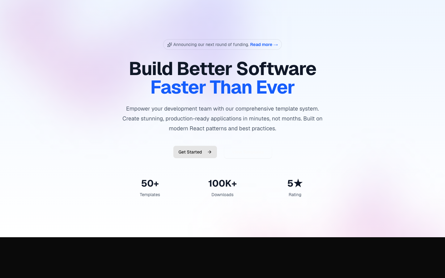
}Landing page hero section with CTA and gradient background
hero-01

Files
import { Button } from "@/components/ui/button"
import { ArrowRight, Play } from "lucide-react"

export default function HeroTemplate() {
  return (
    <section className="relative min-h-[600px] overflow-hidden">
      <div
        className="absolute inset-0 z-0"
        style={{
          backgroundImage: "url('https://images.unsplash.com/photo-1451187580459-43490279c0fa?q=80&w=2072')",
          backgroundSize: "cover",
          backgroundPosition: "center",
        }}
      >
        <div className="absolute inset-0 bg-gradient-to-r from-black/80 via-black/60 to-transparent" />
      </div>

      <div className="relative z-10 mx-auto max-w-7xl px-6 py-24 sm:py-32 lg:px-8">
        <div className="max-w-2xl">
          <div className="mb-6 inline-flex items-center rounded-full border border-white/20 bg-white/10 px-4 py-1.5 backdrop-blur-sm">
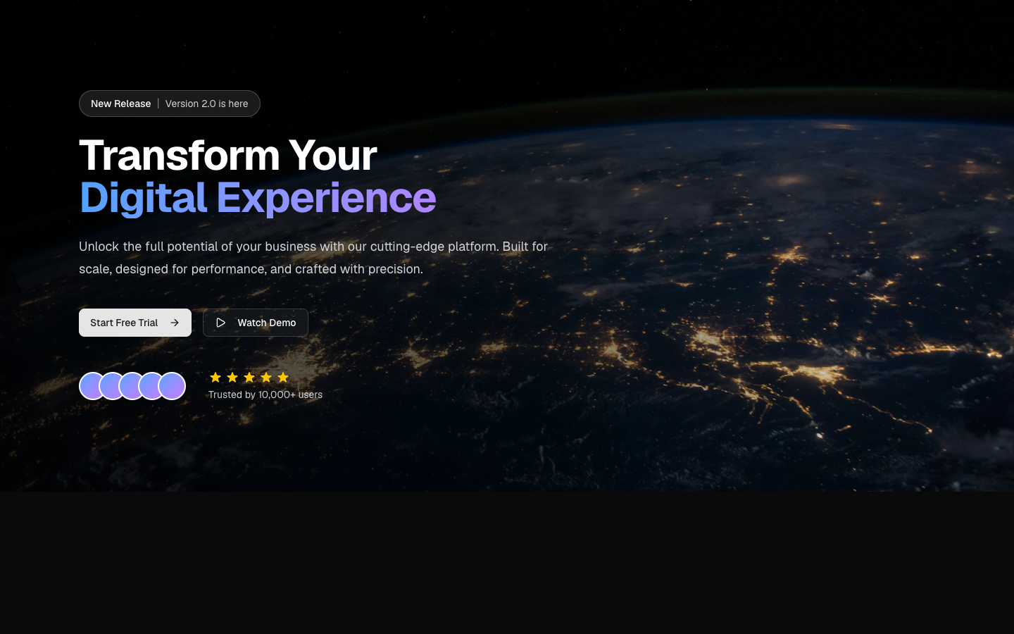
            <span className="text-sm font-medium text-white">New Release</span>
            <span className="mx-2 text-white/40">|</span>
            <span className="text-sm text-white/80">Version 2.0 is here</span>
          </div>

          <h1 className="text-4xl font-bold tracking-tight text-white sm:text-6xl">
            Transform Your
            <span className="block bg-gradient-to-r from-blue-400 to-purple-400 bg-clip-text text-transparent">
              Digital Experience
            </span>
          </h1>

          <p className="mt-6 text-lg leading-8 text-gray-300">
            Unlock the full potential of your business with our cutting-edge
            platform. Built for scale, designed for performance, and crafted
            with precision.
          </p>

          <div className="mt-10 flex flex-wrap items-center gap-4">
            <Button size="lg" className="px-8">
              Start Free Trial
              <ArrowRight className="ml-2 h-4 w-4" />
            </Button>
            <Button
              size="lg"
              variant="outline"
              className="border-white/20 bg-white/10 text-white hover:bg-white/20"
            >
              <Play className="mr-2 h-4 w-4" />
              Watch Demo
            </Button>
          </div>

          <div className="mt-12 flex items-center gap-8">
            <div className="flex -space-x-3">
              {[1, 2, 3, 4, 5].map((i) => (
                <div
                  key={i}
                  className="h-10 w-10 rounded-full border-2 border-white bg-gradient-to-br from-blue-400 to-purple-400"
                />
              ))}
            </div>
            <div>
              <div className="flex items-center gap-1">
                {[1, 2, 3, 4, 5].map((i) => (
                  <svg
                    key={i}
                    className="h-5 w-5 text-yellow-400"
                    fill="currentColor"
                    viewBox="0 0 20 20"
                  >
                    <path d="M9.049 2.927c.3-.921 1.603-.921 1.902 0l1.07 3.292a1 1 0 00.95.69h3.462c.969 0 1.371 1.24.588 1.81l-2.8 2.034a1 1 0 00-.364 1.118l1.07 3.292c.3.921-.755 1.688-1.54 1.118l-2.8-2.034a1 1 0 00-1.175 0l-2.8 2.034c-.784.57-1.838-.197-1.539-1.118l1.07-3.292a1 1 0 00-.364-1.118L2.98 8.72c-.783-.57-.38-1.81.588-1.81h3.461a1 1 0 00.951-.69l1.07-3.292z" />
                  </svg>
                ))}
              </div>
              <p className="mt-1 text-sm text-white/80">Trusted by 10,000+ users</p>
            </div>
          </div>
        </div>
      </div>
    </section>
  )
}
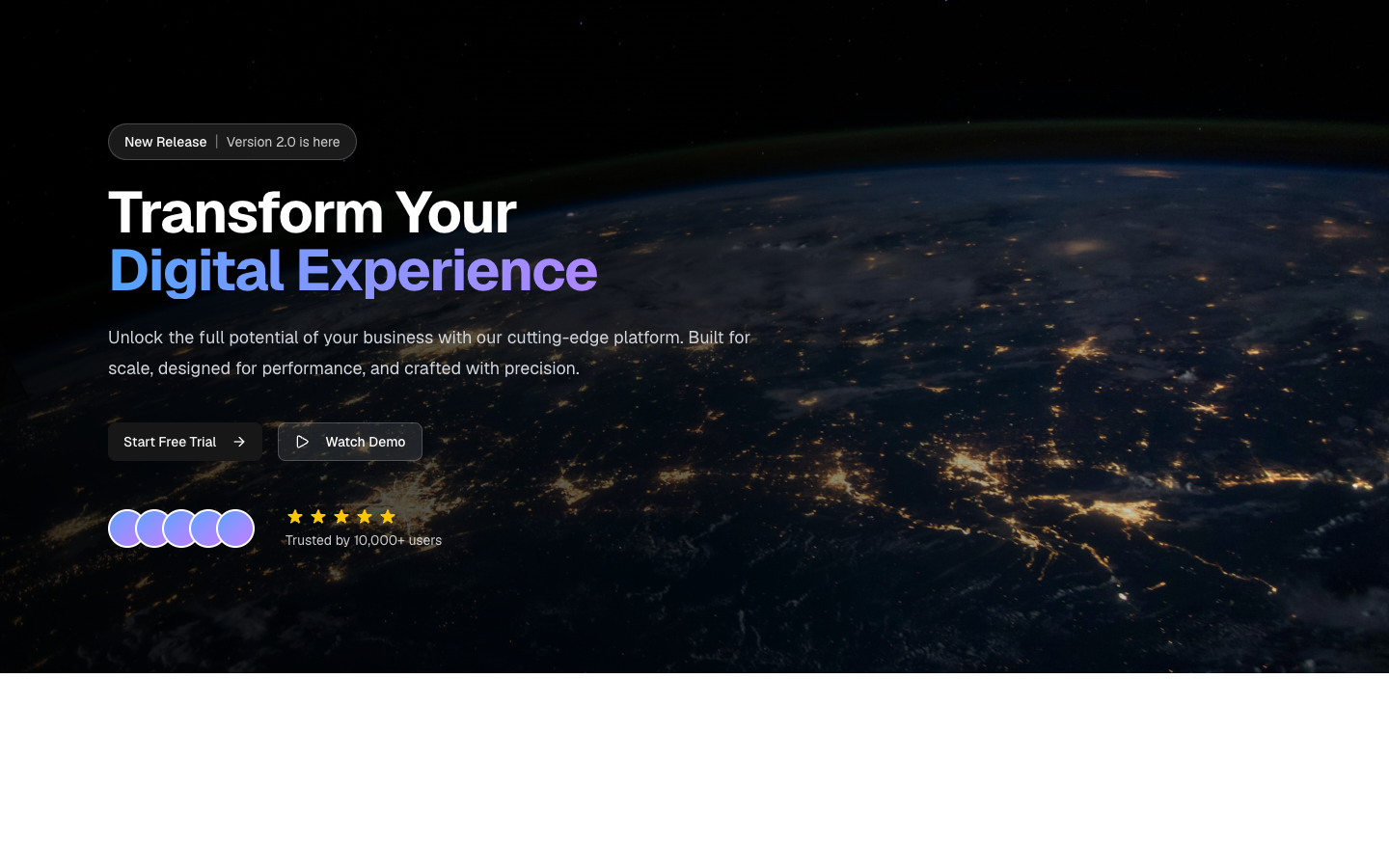
Hero section with image background and overlay
hero-02
Files
import { Button } from "@/components/ui/button"
import { Badge } from "@/components/ui/badge"
import { ArrowRight, CheckCircle2 } from "lucide-react"

const features = [
  "Free 14-day trial",
  "No credit card required",
  "Cancel anytime",
]

export default function HeroTemplate() {
  return (
    <section className="overflow-hidden bg-background py-24 sm:py-32">
      <div className="mx-auto max-w-7xl px-6 lg:px-8">
        <div className="grid gap-12 lg:grid-cols-2 lg:gap-8">
          <div className="flex flex-col justify-center">
            <Badge variant="secondary" className="mb-4 w-fit">
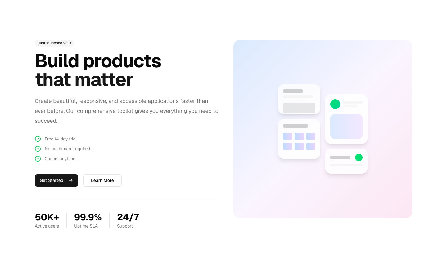
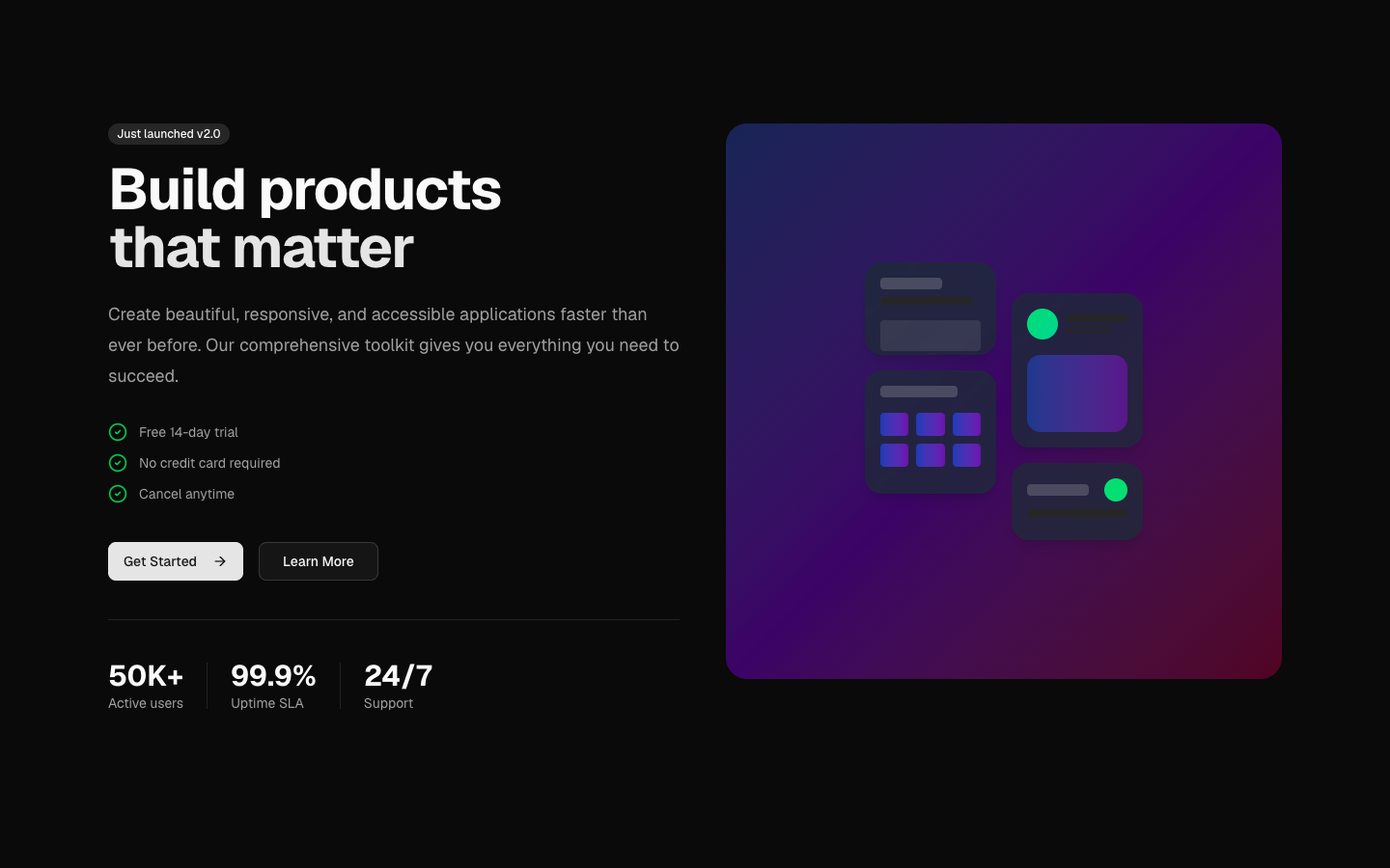
              Just launched v2.0
            </Badge>

            <h1 className="text-4xl font-bold tracking-tight sm:text-5xl lg:text-6xl">
              Build products
              <span className="block text-primary">that matter</span>
            </h1>

            <p className="mt-6 text-lg leading-8 text-muted-foreground">
              Create beautiful, responsive, and accessible applications faster
              than ever before. Our comprehensive toolkit gives you everything
              you need to succeed.
            </p>

            <ul className="mt-8 space-y-3">
              {features.map((feature) => (
                <li key={feature} className="flex items-center gap-3">
                  <CheckCircle2 className="h-5 w-5 text-green-500" />
                  <span className="text-sm text-muted-foreground">{feature}</span>
                </li>
              ))}
            </ul>

            <div className="mt-10 flex flex-wrap gap-4">
              <Button size="lg" className="px-8">
                Get Started
                <ArrowRight className="ml-2 h-4 w-4" />
              </Button>
              <Button size="lg" variant="outline">
                Learn More
              </Button>
            </div>

            <div className="mt-10 flex items-center gap-6 border-t pt-10">
              <div>
                <div className="text-3xl font-bold">50K+</div>
                <div className="text-sm text-muted-foreground">Active users</div>
              </div>
              <div className="h-12 w-px bg-border" />
              <div>
                <div className="text-3xl font-bold">99.9%</div>
                <div className="text-sm text-muted-foreground">Uptime SLA</div>
              </div>
              <div className="h-12 w-px bg-border" />
              <div>
                <div className="text-3xl font-bold">24/7</div>
                <div className="text-sm text-muted-foreground">Support</div>
              </div>
            </div>
          </div>

          <div className="relative lg:ml-4">
            <div className="relative aspect-square overflow-hidden rounded-3xl bg-gradient-to-br from-blue-100 via-purple-50 to-pink-100 dark:from-blue-950 dark:via-purple-950 dark:to-pink-950">
              <div className="absolute inset-0 flex items-center justify-center">
                <div className="grid grid-cols-2 gap-4 p-8">
                  <div className="space-y-4">
                    <div className="h-24 rounded-2xl bg-white/80 p-4 shadow-lg backdrop-blur dark:bg-gray-800/80">
                      <div className="h-3 w-16 rounded bg-primary/20" />
                      <div className="mt-2 h-2 w-24 rounded bg-muted" />
                      <div className="mt-4 h-8 w-full rounded bg-primary/10" />
                    </div>
                    <div className="h-32 rounded-2xl bg-white/80 p-4 shadow-lg backdrop-blur dark:bg-gray-800/80">
                      <div className="h-3 w-20 rounded bg-primary/20" />
                      <div className="mt-4 grid grid-cols-3 gap-2">
                        {[1, 2, 3, 4, 5, 6].map((i) => (
                          <div
                            key={i}
                            className="h-6 rounded bg-gradient-to-r from-blue-200 to-purple-200 dark:from-blue-800 dark:to-purple-800"
                          />
                        ))}
                      </div>
                    </div>
                  </div>
                  <div className="space-y-4 pt-8">
                    <div className="h-40 rounded-2xl bg-white/80 p-4 shadow-lg backdrop-blur dark:bg-gray-800/80">
                      <div className="flex items-center gap-2">
                        <div className="h-8 w-8 rounded-full bg-gradient-to-br from-green-400 to-emerald-400" />
                        <div>
                          <div className="h-2 w-16 rounded bg-muted" />
                          <div className="mt-1 h-2 w-12 rounded bg-muted/60" />
                        </div>
                      </div>
                      <div className="mt-4 h-20 rounded-xl bg-gradient-to-r from-blue-100 to-purple-100 dark:from-blue-900 dark:to-purple-900" />
                    </div>
                    <div className="h-20 rounded-2xl bg-white/80 p-4 shadow-lg backdrop-blur dark:bg-gray-800/80">
                      <div className="flex items-center justify-between">
                        <div className="h-3 w-16 rounded bg-primary/20" />
                        <div className="h-6 w-6 rounded-full bg-green-400" />
                      </div>
                      <div className="mt-2 h-2 w-full rounded bg-muted" />
                    </div>
                  </div>
                </div>
              </div>
            </div>
            <div className="absolute -bottom-4 -right-4 -z-10 h-full w-full rounded-3xl bg-gradient-to-br from-blue-500/20 via-purple-500/20 to-pink-500/20" />
          </div>
        </div>
      </div>
    </section>
  )
}
Hero with split layout - content and image
hero-03
Files
"use client"

import { useEffect, useRef, useState } from "react"

import { Button } from "@/components/ui/button"

// Animated Rive "bubble" gradient behind the hero — originally the databayt.org homepage hero.
function RiveBackground() {
  const canvasRef = useRef<HTMLCanvasElement>(null)
  const [isMobile, setIsMobile] = useState(false)

  useEffect(() => {
    const checkMobile = () => setIsMobile(window.innerWidth < 768)
    checkMobile()
    window.addEventListener("resize", checkMobile)
    return () => window.removeEventListener("resize", checkMobile)
  }, [])

  useEffect(() => {
    let rive: { cleanup: () => void } | null = null

    const initRive = async () => {
      if (!canvasRef.current) return
      const { Rive } = await import("@rive-app/webgl2")
      rive = new Rive({
        src: "/templates/hero-04/bubble-tiptap.riv",
        canvas: canvasRef.current,
        artboard: "bubble",
        animations: "bubble-timeline",
        autoplay: true,
      })
    }

    initRive()
    return () => rive?.cleanup()
  }, [])

  return (
    <div className="pointer-events-none absolute inset-0 z-0 overflow-hidden">
      {/* Top fade — blends into the header */}
      <div
        className="pointer-events-none absolute inset-0 z-10"
        style={{
          background:
            "linear-gradient(to bottom, var(--background) 0%, transparent 8%)",
        }}
      />
      <div className="absolute inset-0 z-[1] select-none">
        <div
          className="relative flex select-none items-start justify-center"
          style={{
            top: isMobile ? "50%" : "-40%",
            left: isMobile ? "50%" : "20%",
            transform: isMobile ? "translate(-50%, -50%)" : "none",
            paddingTop: isMobile ? "0" : "20rem",
          }}
        >
          <canvas
            ref={canvasRef}
            className="select-none"
            style={{
              width: isMobile ? "200vw" : "120vw",
              maxWidth: isMobile ? "120rem" : "80rem",
              aspectRatio: isMobile ? "3 / 2" : "2 / 1",
            }}
          />
        </div>
      </div>
    </div>
  )
}

const ctaClass =
  "h-auto w-52 rounded-2xl px-6 py-3 font-semibold transition-all duration-300 hover:-translate-x-1 hover:-translate-y-1 hover:rounded-3xl hover:shadow-[4px_4px_0px_var(--foreground)] active:translate-x-0 active:translate-y-0 active:rounded-2xl active:shadow-none md:w-48 md:py-2"

export default function HeroTemplate() {
  return (
    <section className="relative flex h-screen items-center justify-start overflow-hidden md:justify-center">
      <RiveBackground />
      <div className="relative z-10 px-6 md:px-0">
        <div className="flex flex-col items-start gap-4 text-start md:items-center md:text-center">
          <h1 className="text-5xl font-black sm:text-7xl md:text-6xl lg:text-[90px]">
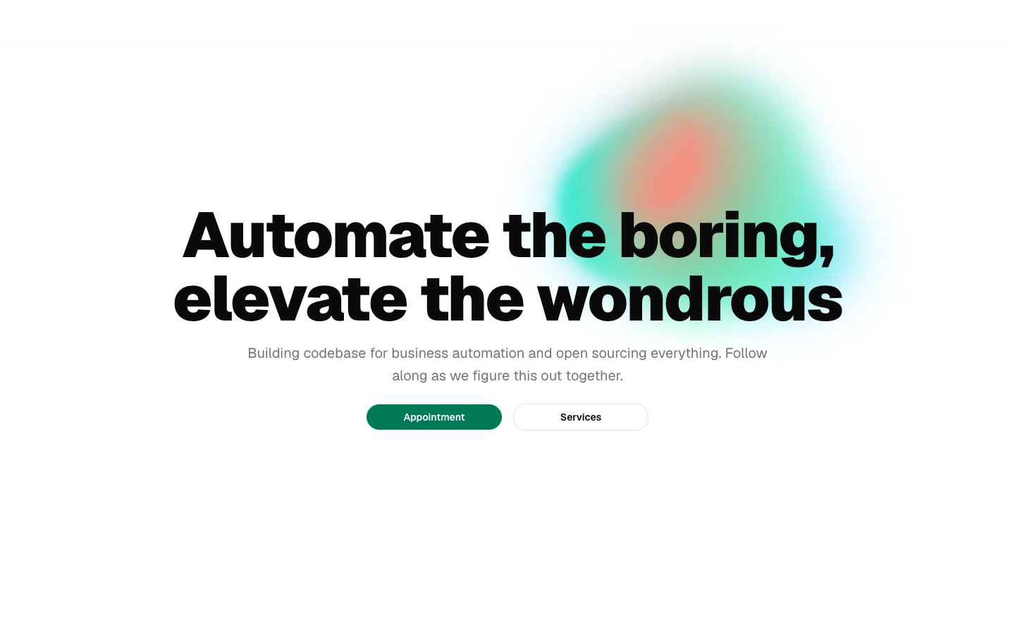
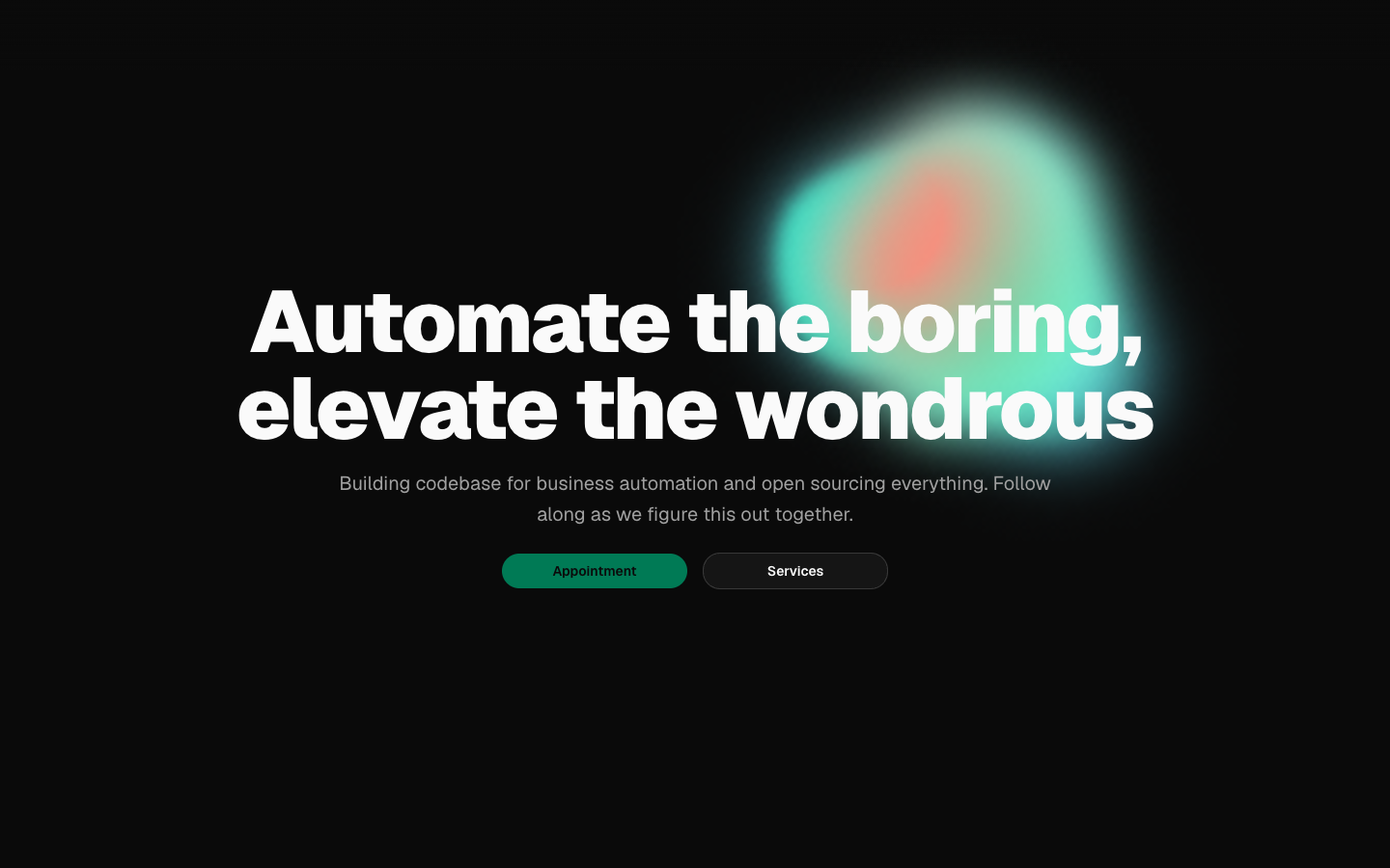
            Automate the boring,
            <br />
            elevate the wondrous
          </h1>
          <p className="leading-normal text-muted-foreground sm:text-xl sm:leading-8 md:max-w-3xl">
            Building codebase for business automation and open sourcing
            everything. Follow along as we figure this out together.
          </p>
          <div className="mt-2 flex flex-col items-start gap-4 md:mx-auto md:flex-row md:items-center">
            <Button className={`${ctaClass} bg-emerald-700 text-background hover:bg-emerald-700`}>
              Appointment
            </Button>
            <Button variant="outline" className={ctaClass}>
              Services
            </Button>
          </div>
        </div>
      </div>
    </section>
  )
}
Hero with animated Rive gradient background and dual CTA
hero-04
Files
import { Hero } from "@/components/hero-05"
import { dictionary } from "@/registry/bases/base/blocks/hero-05/hero-05-dictionary"

export default async function Page({
  params,
}: {
  params?: Promise<{ lang?: string }>
}) {
  const { lang } = (await params) ?? {}
  const locale = lang === "ar" ? "ar" : "en"
  return <Hero dictionary={dictionary[locale]} lang={locale} />
}
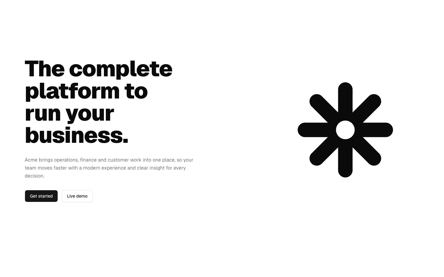
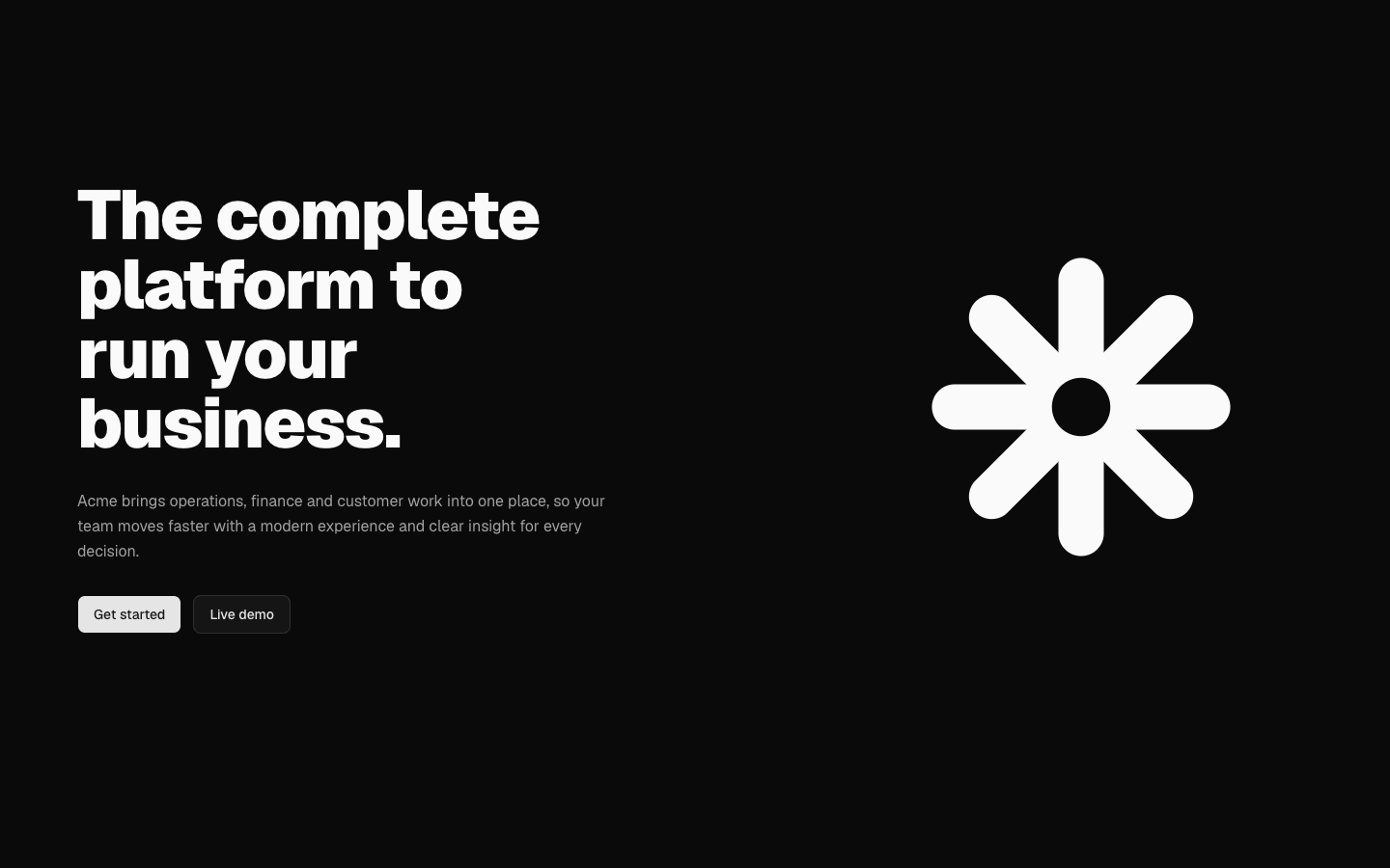
A split hero with a stacked black headline, subtitle and two actions beside a large geometric brand mark.
hero-05
Files
import { Hero } from "@/components/hero-06"
import { dictionary } from "@/registry/bases/base/blocks/hero-06/hero-06-dictionary"

export default async function Page({
  params,
}: {
  params?: Promise<{ lang?: string }>
}) {
  const { lang } = (await params) ?? {}
  const locale = lang === "ar" ? "ar" : "en"
  return <Hero dictionary={dictionary[locale]} lang={locale} />
}
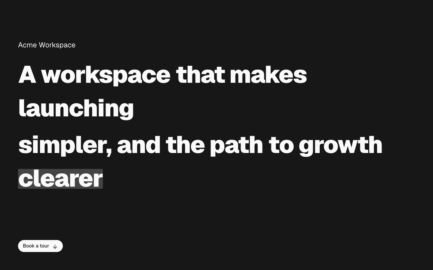
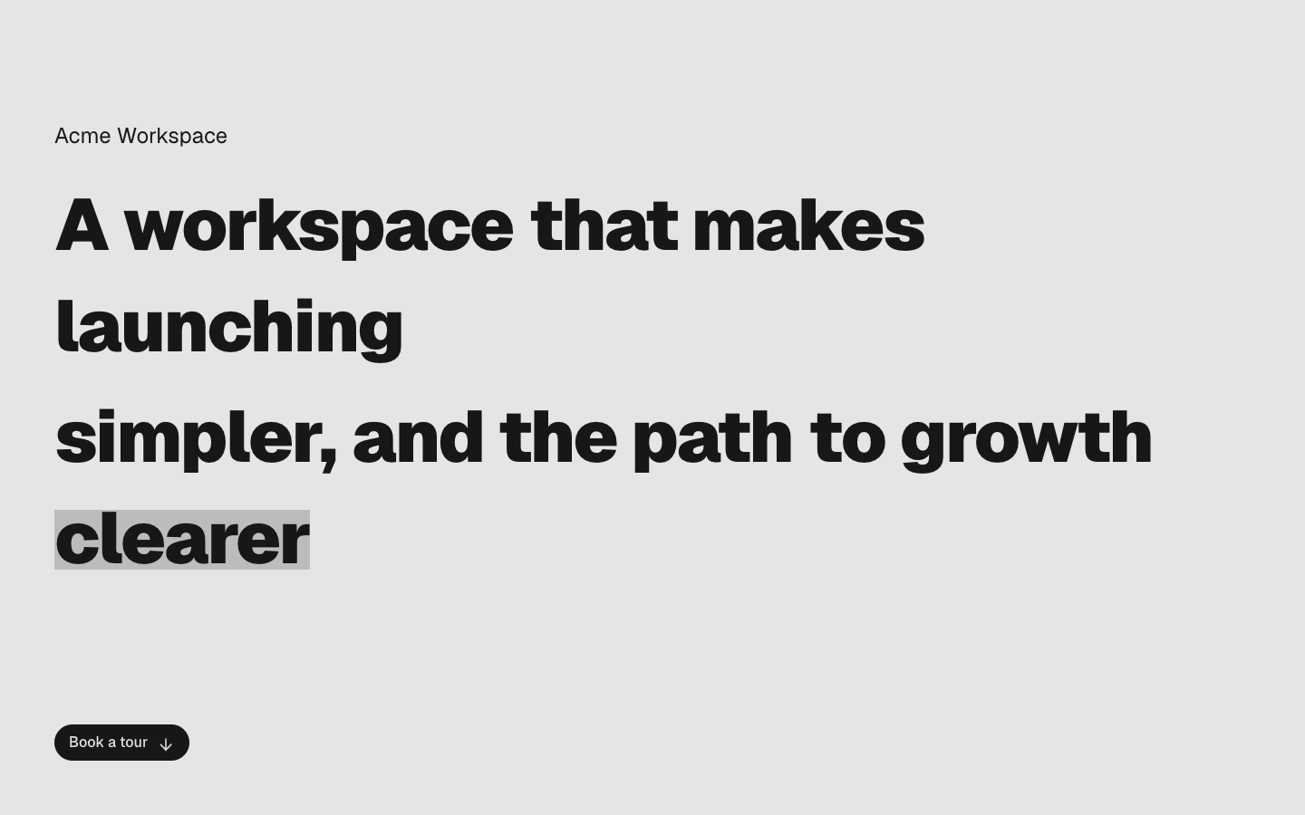
A full-bleed editorial hero on a solid primary field with an oversized word-group headline, a highlighted closing phrase and a scroll-down pill.
hero-06
Files
import { Hero } from "@/components/hero-07"
import { dictionary } from "@/registry/bases/base/blocks/hero-07/hero-07-dictionary"

export default async function Page({
  params,
}: {
  params?: Promise<{ lang?: string }>
}) {
  const { lang } = (await params) ?? {}
  const locale = lang === "ar" ? "ar" : "en"
  return <Hero dictionary={dictionary[locale]} lang={locale} />
}
A full-screen photo or video hero with a word-by-word 3D headline reveal and a pill search field.
hero-07


Files
import { Hero } from "@/components/hero-08"
import { dictionary } from "@/registry/bases/base/blocks/hero-08/hero-08-dictionary"

export default async function Page({
  params,
}: {
  params?: Promise<{ lang?: string }>
}) {
  const { lang } = (await params) ?? {}
  const locale = lang === "ar" ? "ar" : "en"
  return <Hero dictionary={dictionary[locale]} lang={locale} />
}
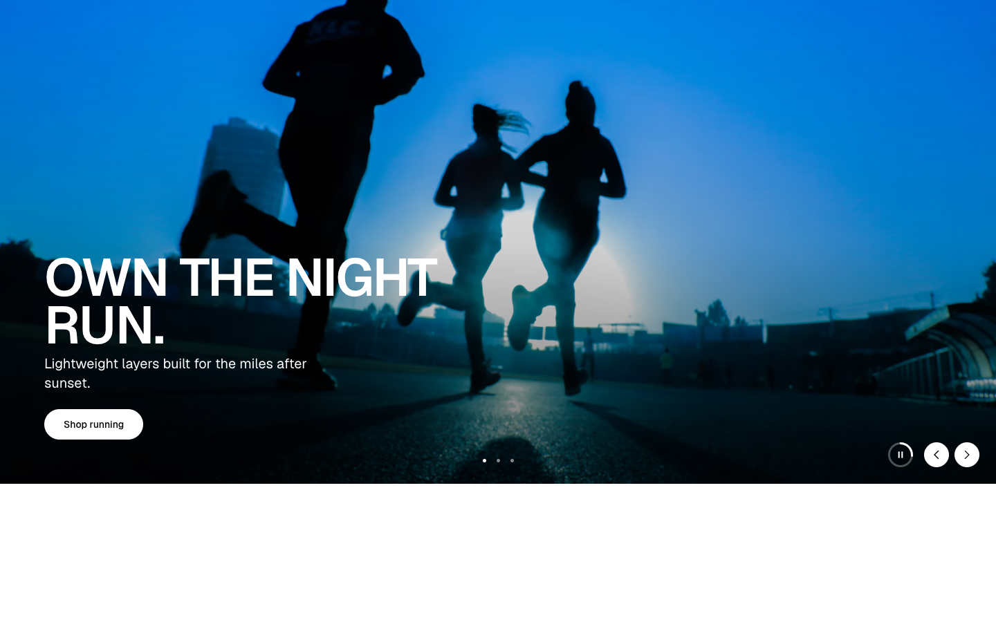
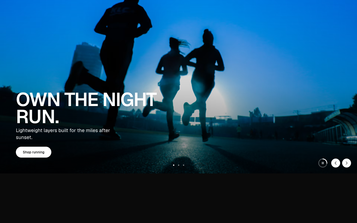
A full-bleed campaign carousel with uppercase headlines, dot pagination and a play/pause control ringed by autoplay progress.
hero-08