18Switch language to English
تيلويند CSSابدأ مع تيلويند الإصدار 4

Templates for the Web

Clean, modern templates. Copy and paste into your apps. Works with all React frameworks. Open Source. Free forever.

Files
app/header-01/page.tsx
import Link from "next/link"
import { Button } from "@/components/ui/button"
import { Sheet, SheetContent, SheetTrigger } from "@/components/ui/sheet"
import { Menu } from "lucide-react"

const navigation = [
  { name: "Products", href: "#" },
  { name: "Features", href: "#" },
  { name: "Pricing", href: "#" },
  { name: "About", href: "#" },
]

export default function HeaderTemplate() {
  return (
    <header className="sticky top-0 z-50 w-full border-b bg-background/95 backdrop-blur supports-[backdrop-filter]:bg-background/60">
      <nav className="mx-auto flex h-16 max-w-7xl items-center justify-between px-6 lg:px-8">
        <div className="flex lg:flex-1">
          <Link href="#" className="-m-1.5 p-1.5">
            <span className="text-xl font-bold">Logo</span>
          </Link>
        </div>

        <div className="hidden lg:flex lg:gap-x-8">
          {navigation.map((item) => (
            <Link
              key={item.name}
              href={item.href}
              className="text-sm font-medium text-muted-foreground transition-colors hover:text-foreground"
            >
              {item.name}
            </Link>
          ))}
        </div>

        <div className="hidden lg:flex lg:flex-1 lg:justify-end lg:gap-x-4">
          <Button variant="ghost" size="sm">
            Sign in
          </Button>
          <Button size="sm">Get Started</Button>
        </div>

        <div className="flex lg:hidden">
          <Sheet>
            <SheetTrigger render={<Button variant="ghost" size="icon" />}>
              <Menu className="h-5 w-5" />
              <span className="sr-only">Open menu</span>
            </SheetTrigger>
            <SheetContent side="right" className="w-[300px]">
              <div className="mt-6 flow-root">
                <div className="space-y-2 py-6">
                  {navigation.map((item) => (
                    <Link
                      key={item.name}
                      href={item.href}
                      className="block rounded-lg px-3 py-2 text-base font-medium text-muted-foreground hover:bg-muted hover:text-foreground"
                    >
                      {item.name}
                    </Link>
                  ))}
                </div>
                <div className="border-t py-6">
                  <Button className="w-full" size="sm">
                    Sign in
                  </Button>
                </div>
              </div>
            </SheetContent>
          </Sheet>
        </div>
      </nav>
    </header>
  )
}
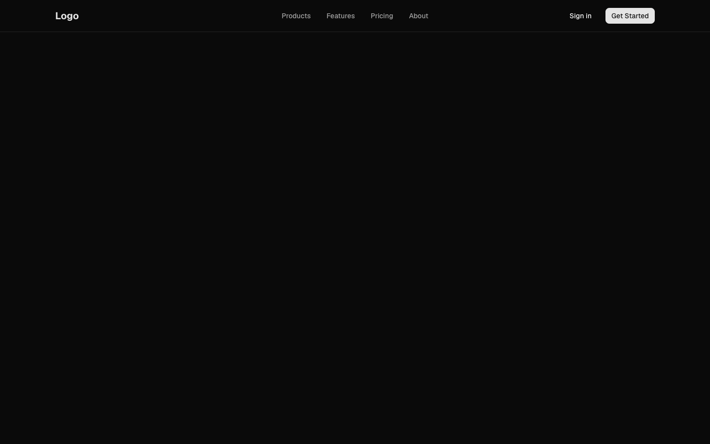
Responsive navigation header with logo and menu links
header-01
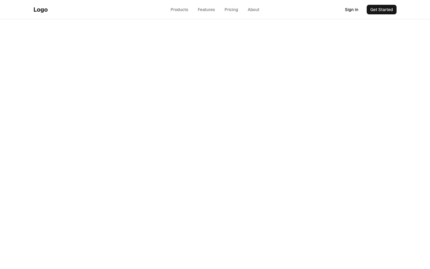
header-01
Files
app/header-02/page.tsx
import Link from "next/link"
import { Button } from "@/components/ui/button"
import {
  NavigationMenu,
  NavigationMenuContent,
  NavigationMenuItem,
  NavigationMenuLink,
  NavigationMenuList,
  NavigationMenuTrigger,
} from "@/components/ui/navigation-menu"
import {
  DropdownMenu,
  DropdownMenuContent,
  DropdownMenuItem,
  DropdownMenuSeparator,
  DropdownMenuTrigger,
} from "@/components/ui/dropdown-menu"
import { Avatar, AvatarFallback, AvatarImage } from "@/components/ui/avatar"
import { Bell, Settings, LogOut, User } from "lucide-react"

const products = [
  { title: "Analytics", description: "Track user behavior and engagement", href: "#" },
  { title: "Automation", description: "Automate repetitive tasks", href: "#" },
  { title: "Integrations", description: "Connect with your tools", href: "#" },
]

export default function HeaderTemplate() {
  return (
    <header className="sticky top-0 z-50 w-full border-b bg-background">
      <div className="mx-auto flex h-16 max-w-7xl items-center justify-between px-6 lg:px-8">
        <div className="flex items-center gap-8">
          <Link href="#" className="text-xl font-bold">
            Logo
          </Link>

          <NavigationMenu className="hidden lg:flex">
            <NavigationMenuList>
              <NavigationMenuItem>
                <NavigationMenuTrigger>Products</NavigationMenuTrigger>
                <NavigationMenuContent>
                  <ul className="grid w-[400px] gap-3 p-4">
                    {products.map((product) => (
                      <li key={product.title}>
                        <NavigationMenuLink
                          render={
                            <Link
                              href={product.href}
                              className="block select-none space-y-1 rounded-md p-3 leading-none no-underline outline-none transition-colors hover:bg-accent hover:text-accent-foreground focus:bg-accent focus:text-accent-foreground"
                            />
                          }
                        >
                          <div className="text-sm font-medium leading-none">
                            {product.title}
                          </div>
                          <p className="line-clamp-2 text-sm leading-snug text-muted-foreground">
                            {product.description}
                          </p>
                        </NavigationMenuLink>
                      </li>
                    ))}
                  </ul>
                </NavigationMenuContent>
              </NavigationMenuItem>
              <NavigationMenuItem>
                <NavigationMenuLink
                  render={<Link href="#" />}
                  className="group inline-flex h-10 w-max items-center justify-center rounded-md bg-background px-4 py-2 text-sm font-medium transition-colors hover:bg-accent hover:text-accent-foreground focus:bg-accent focus:text-accent-foreground focus:outline-none disabled:pointer-events-none disabled:opacity-50 data-active:bg-accent/50"
                >
                  Pricing
                </NavigationMenuLink>
              </NavigationMenuItem>
              <NavigationMenuItem>
                <NavigationMenuLink
                  render={<Link href="#" />}
                  className="group inline-flex h-10 w-max items-center justify-center rounded-md bg-background px-4 py-2 text-sm font-medium transition-colors hover:bg-accent hover:text-accent-foreground focus:bg-accent focus:text-accent-foreground focus:outline-none disabled:pointer-events-none disabled:opacity-50 data-active:bg-accent/50"
                >
                  Docs
                </NavigationMenuLink>
              </NavigationMenuItem>
            </NavigationMenuList>
          </NavigationMenu>
        </div>

        <div className="flex items-center gap-4">
          <Button variant="ghost" size="icon" className="relative">
            <Bell className="h-5 w-5" />
            <span className="absolute -right-1 -top-1 flex h-4 w-4 items-center justify-center rounded-full bg-primary text-[10px] text-primary-foreground">
              3
            </span>
          </Button>

          <DropdownMenu>
            <DropdownMenuTrigger
              render={
                <Button variant="ghost" className="relative h-8 w-8 rounded-full" />
              }
            >
              <Avatar className="h-8 w-8">
                <AvatarImage src="/avatars/01.png" alt="User" />
                <AvatarFallback>JD</AvatarFallback>
              </Avatar>
            </DropdownMenuTrigger>
            <DropdownMenuContent className="w-56" align="end">
              <div className="flex items-center justify-start gap-2 p-2">
                <div className="flex flex-col space-y-1 leading-none">
                  <p className="font-medium">John Doe</p>
                  <p className="text-sm text-muted-foreground">john@example.com</p>
                </div>
              </div>
              <DropdownMenuSeparator />
              <DropdownMenuItem>
                <User className="mr-2 h-4 w-4" />
                Profile
              </DropdownMenuItem>
              <DropdownMenuItem>
                <Settings className="mr-2 h-4 w-4" />
                Settings
              </DropdownMenuItem>
              <DropdownMenuSeparator />
              <DropdownMenuItem className="text-red-600">
                <LogOut className="mr-2 h-4 w-4" />
                Log out
              </DropdownMenuItem>
            </DropdownMenuContent>
          </DropdownMenu>
        </div>
      </div>
    </header>
  )
}
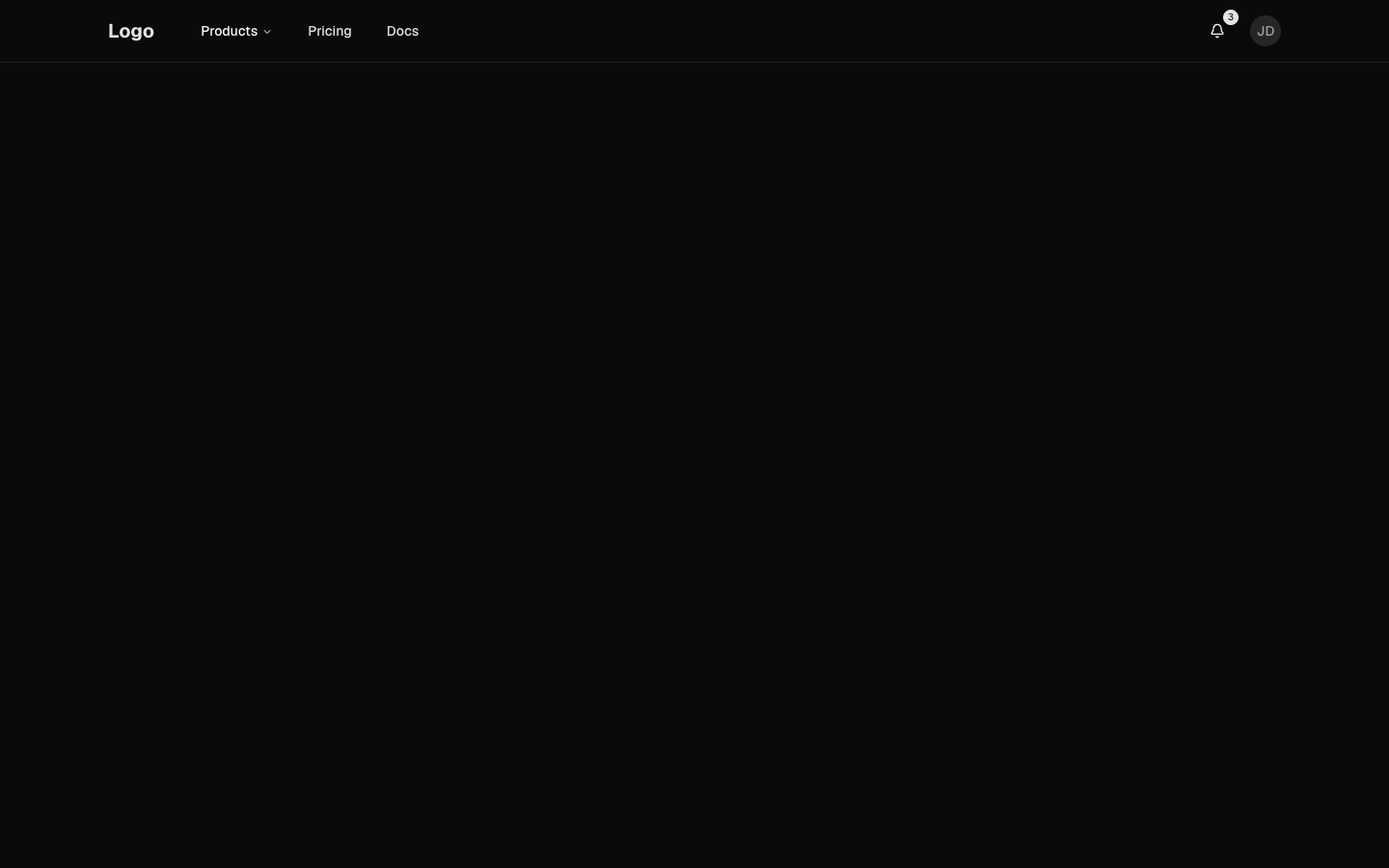
Header with dropdown navigation and user menu
header-02
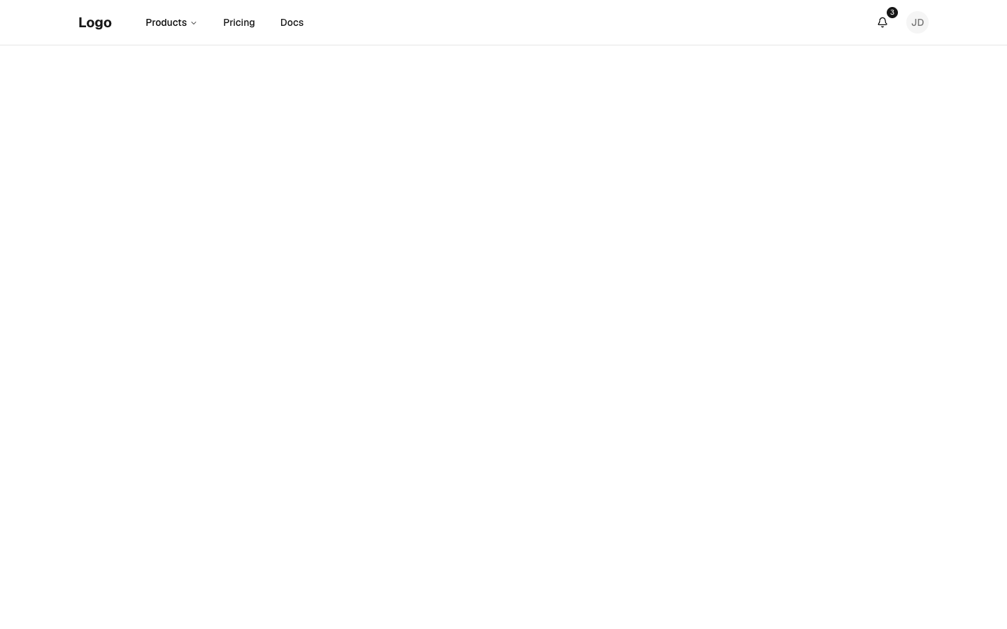
header-02
Files
app/header-03/page.tsx
import { Header } from "@/components/header-03"
import { dictionary } from "@/registry/bases/base/blocks/header-03/header-03-dictionary"

export default async function Page({
  params,
}: {
  params?: Promise<{ lang?: string }>
}) {
  const { lang } = (await params) ?? {}
  const locale = lang === "ar" ? "ar" : "en"
  return (
    <div className="flex min-h-svh flex-col">
      <Header dictionary={dictionary[locale]} lang={locale} />
      <main className="flex-1 bg-muted/40" />
    </div>
  )
}
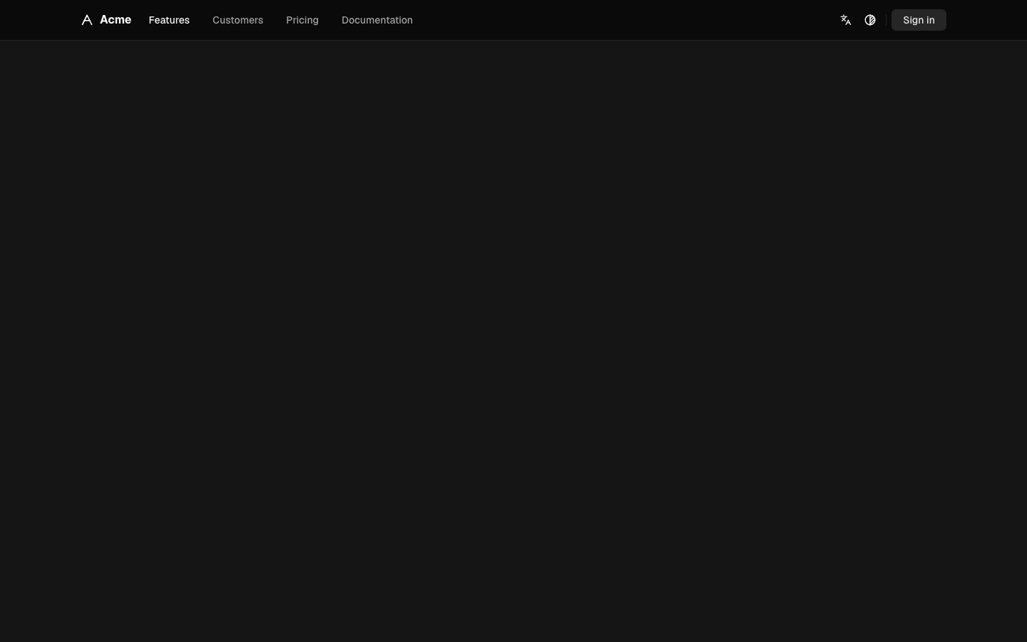
Thin sticky bar: mark and quiet text links on the start side, language, theme and sign-in on the end; a "Menu" control opens a sheet of large links on phones.
header-03
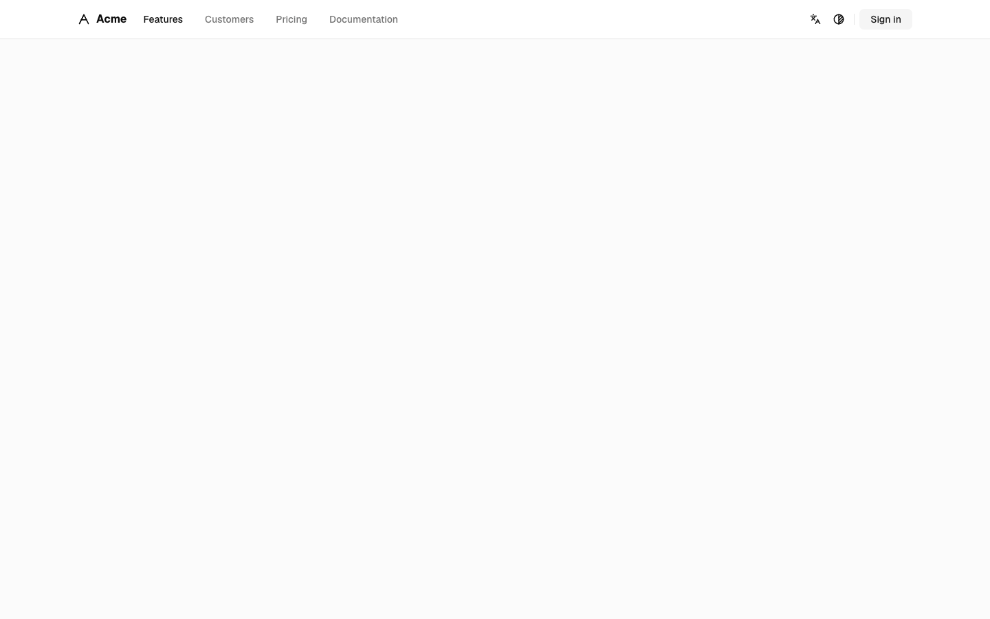
header-03
Files
app/header-04/page.tsx
import { Header } from "@/components/header-04"
import { dictionary } from "@/registry/bases/base/blocks/header-04/header-04-dictionary"

export default async function Page({
  params,
}: {
  params?: Promise<{ lang?: string }>
}) {
  const { lang } = (await params) ?? {}
  const locale = lang === "ar" ? "ar" : "en"
  return (
    <div className="flex min-h-svh flex-col">
      <Header dictionary={dictionary[locale]} lang={locale} />
      <main id="main" className="flex-1 bg-muted/40" />
    </div>
  )
}
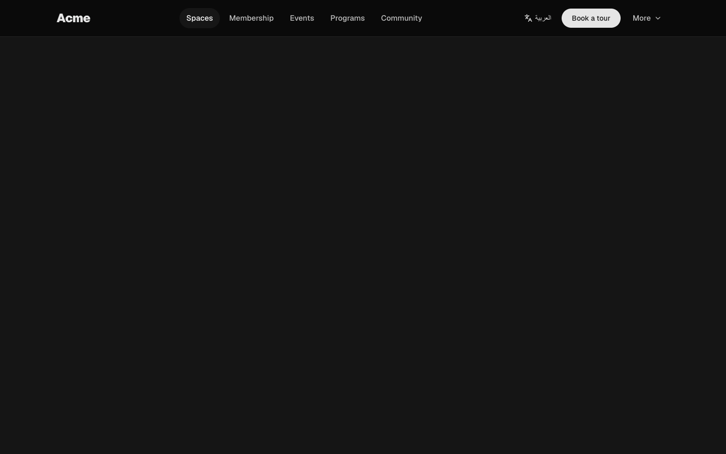
Bold wordmark with pill-shaped nav links, a language link, a rounded call-to-action and a "More" menu; a full-height sheet of large links on phones.
header-04
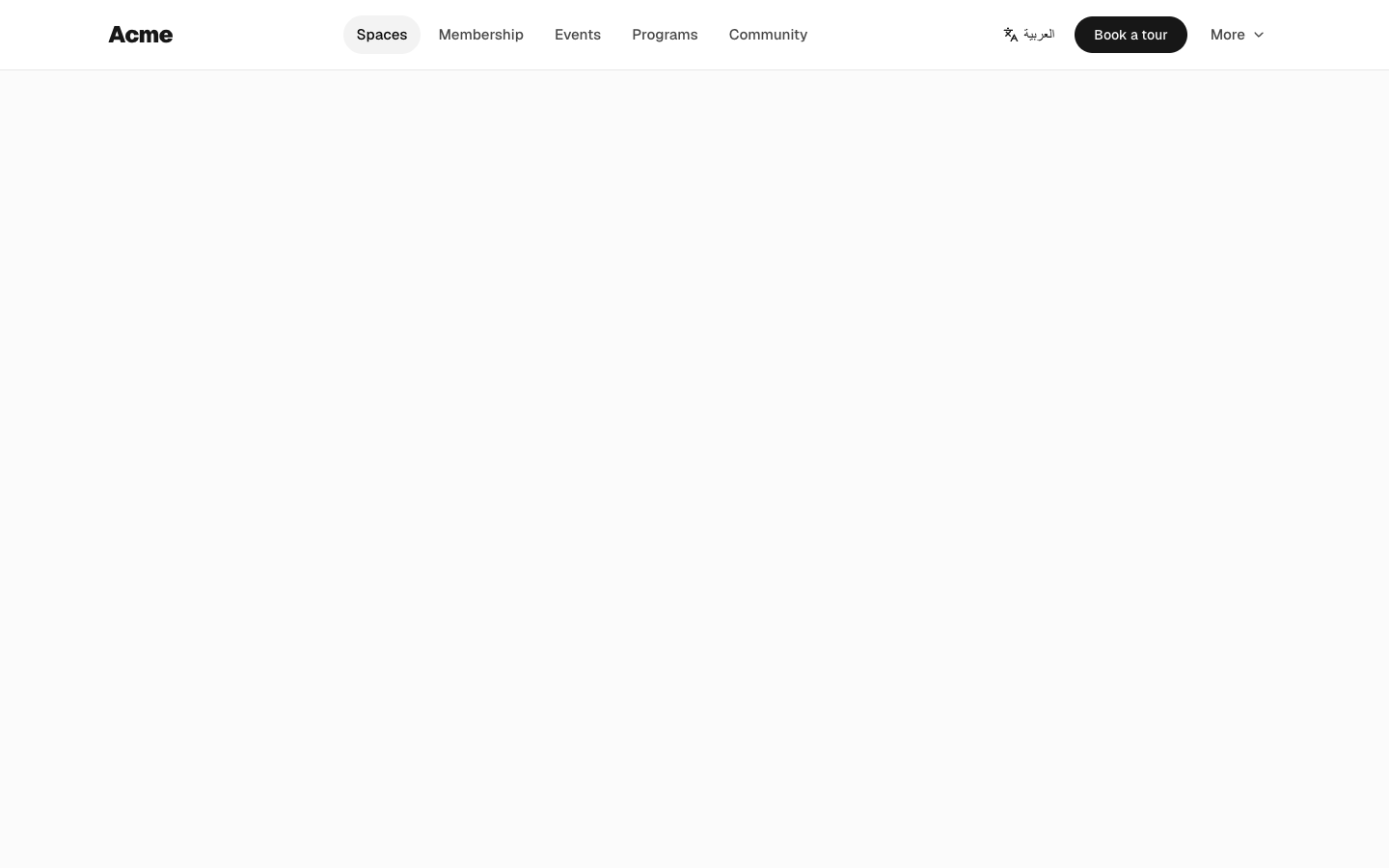
header-04
Files
app/header-05/page.tsx
import { Header } from "@/components/header-05"
import { dictionary } from "@/registry/bases/base/blocks/header-05/header-05-dictionary"

export default async function Page({
  params,
}: {
  params?: Promise<{ lang?: string }>
}) {
  const { lang } = (await params) ?? {}
  const locale = lang === "ar" ? "ar" : "en"
  return (
    <div className="flex min-h-svh flex-col">
      <Header dictionary={dictionary[locale]} lang={locale} />
      <main className="flex-1 bg-muted/40" />
    </div>
  )
}
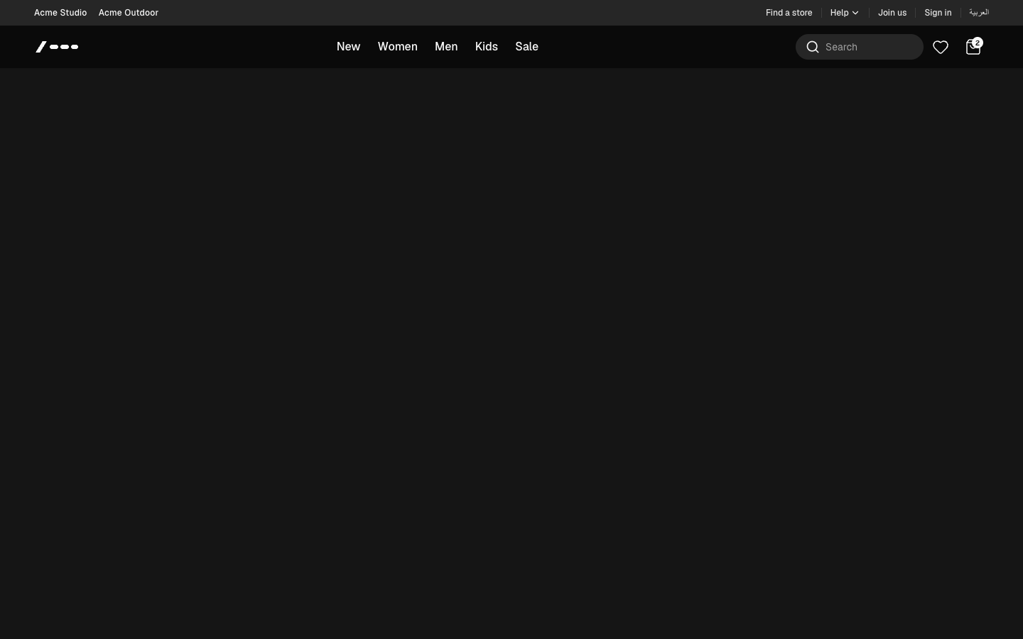
Storefront header: utility top bar with a help dropdown, category nav with full-width mega menus, an expanding search tray, favorites and bag, and an accordion drawer on phones.
header-05
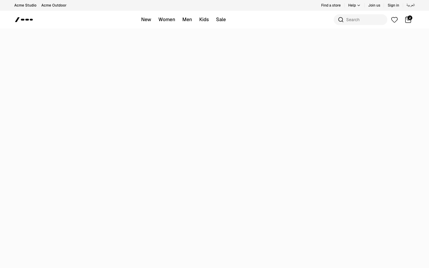
header-05