18Switch language to العربية
Tailwind CSSGet Started with Tailwind v4

Templates for the Web

Clean, modern templates. Copy and paste into your apps. Works with all React frameworks. Open Source. Free forever.

Files
app/header-01/page.tsx
import Link from "next/link"
import { Button } from "@/components/ui/button"
import { Sheet, SheetContent, SheetTrigger } from "@/components/ui/sheet"
import { Menu } from "lucide-react"

const navigation = [
  { name: "Products", href: "#" },
  { name: "Features", href: "#" },
  { name: "Pricing", href: "#" },
  { name: "About", href: "#" },
]

export default function HeaderTemplate() {
  return (
    <header className="sticky top-0 z-50 w-full border-b bg-background/95 backdrop-blur supports-[backdrop-filter]:bg-background/60">
      <nav className="mx-auto flex h-16 max-w-7xl items-center justify-between px-6 lg:px-8">
        <div className="flex lg:flex-1">
          <Link href="#" className="-m-1.5 p-1.5">
            <span className="text-xl font-bold">Logo</span>
          </Link>
        </div>

        <div className="hidden lg:flex lg:gap-x-8">
          {navigation.map((item) => (
            <Link
              key={item.name}
              href={item.href}
              className="text-sm font-medium text-muted-foreground transition-colors hover:text-foreground"
            >
              {item.name}
            </Link>
          ))}
        </div>

        <div className="hidden lg:flex lg:flex-1 lg:justify-end lg:gap-x-4">
          <Button variant="ghost" size="sm">
            Sign in
          </Button>
          <Button size="sm">Get Started</Button>
        </div>

        <div className="flex lg:hidden">
          <Sheet>
            <SheetTrigger render={<Button variant="ghost" size="icon" />}>
              <Menu className="h-5 w-5" />
              <span className="sr-only">Open menu</span>
            </SheetTrigger>
            <SheetContent side="right" className="w-[300px]">
              <div className="mt-6 flow-root">
                <div className="space-y-2 py-6">
                  {navigation.map((item) => (
                    <Link
                      key={item.name}
                      href={item.href}
                      className="block rounded-lg px-3 py-2 text-base font-medium text-muted-foreground hover:bg-muted hover:text-foreground"
                    >
                      {item.name}
                    </Link>
                  ))}
                </div>
                <div className="border-t py-6">
                  <Button className="w-full" size="sm">
                    Sign in
                  </Button>
                </div>
              </div>
            </SheetContent>
          </Sheet>
        </div>
      </nav>
    </header>
  )
}
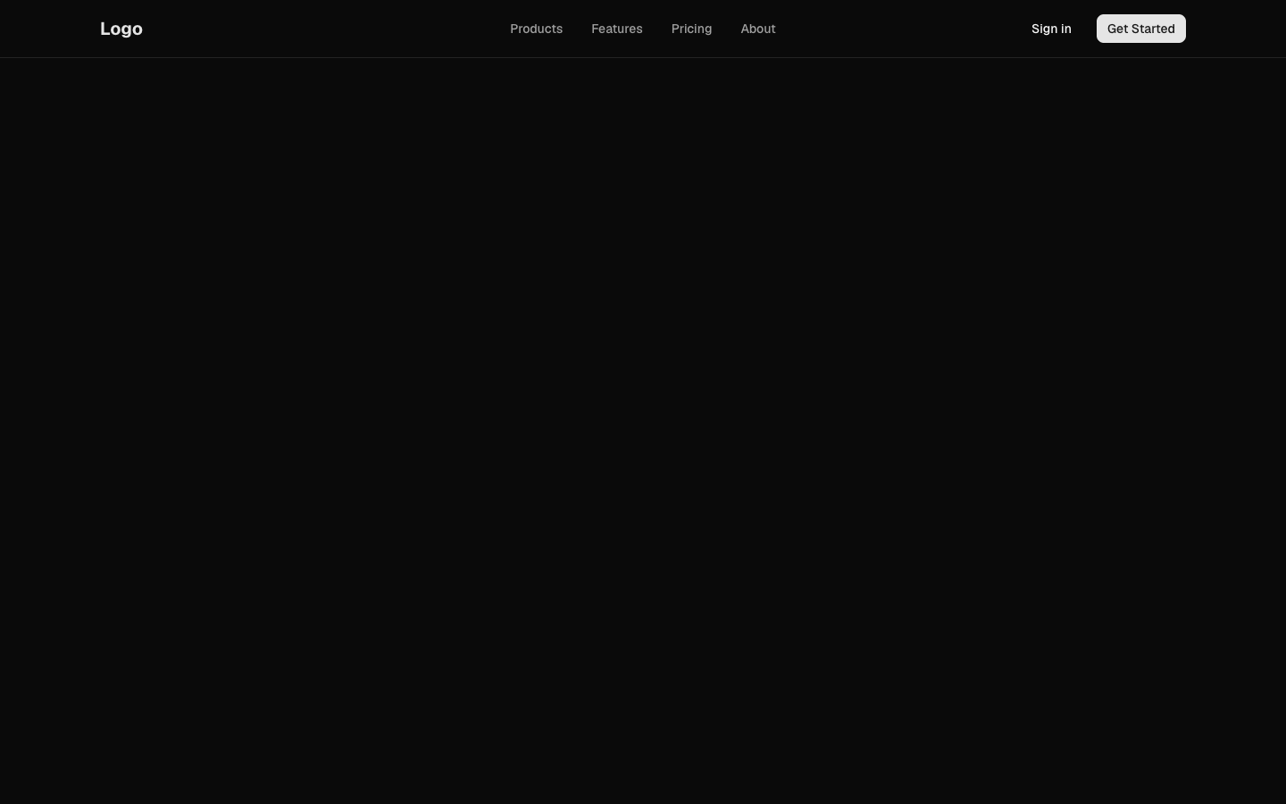
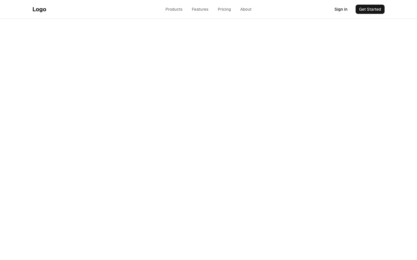
Responsive navigation header with logo and menu links
header-01
header-01
Files
app/header-02/page.tsx
import Link from "next/link"
import { Button } from "@/components/ui/button"
import {
  NavigationMenu,
  NavigationMenuContent,
  NavigationMenuItem,
  NavigationMenuLink,
  NavigationMenuList,
  NavigationMenuTrigger,
} from "@/components/ui/navigation-menu"
import {
  DropdownMenu,
  DropdownMenuContent,
  DropdownMenuItem,
  DropdownMenuSeparator,
  DropdownMenuTrigger,
} from "@/components/ui/dropdown-menu"
import { Avatar, AvatarFallback, AvatarImage } from "@/components/ui/avatar"
import { Bell, Settings, LogOut, User } from "lucide-react"

const products = [
  { title: "Analytics", description: "Track user behavior and engagement", href: "#" },
  { title: "Automation", description: "Automate repetitive tasks", href: "#" },
  { title: "Integrations", description: "Connect with your tools", href: "#" },
]

export default function HeaderTemplate() {
  return (
    <header className="sticky top-0 z-50 w-full border-b bg-background">
      <div className="mx-auto flex h-16 max-w-7xl items-center justify-between px-6 lg:px-8">
        <div className="flex items-center gap-8">
          <Link href="#" className="text-xl font-bold">
            Logo
          </Link>

          <NavigationMenu className="hidden lg:flex">
            <NavigationMenuList>
              <NavigationMenuItem>
                <NavigationMenuTrigger>Products</NavigationMenuTrigger>
                <NavigationMenuContent>
                  <ul className="grid w-[400px] gap-3 p-4">
                    {products.map((product) => (
                      <li key={product.title}>
                        <NavigationMenuLink
                          render={
                            <Link
                              href={product.href}
                              className="block select-none space-y-1 rounded-md p-3 leading-none no-underline outline-none transition-colors hover:bg-accent hover:text-accent-foreground focus:bg-accent focus:text-accent-foreground"
                            />
                          }
                        >
                          <div className="text-sm font-medium leading-none">
                            {product.title}
                          </div>
                          <p className="line-clamp-2 text-sm leading-snug text-muted-foreground">
                            {product.description}
                          </p>
                        </NavigationMenuLink>
                      </li>
                    ))}
                  </ul>
                </NavigationMenuContent>
              </NavigationMenuItem>
              <NavigationMenuItem>
                <NavigationMenuLink
                  render={<Link href="#" />}
                  className="group inline-flex h-10 w-max items-center justify-center rounded-md bg-background px-4 py-2 text-sm font-medium transition-colors hover:bg-accent hover:text-accent-foreground focus:bg-accent focus:text-accent-foreground focus:outline-none disabled:pointer-events-none disabled:opacity-50 data-active:bg-accent/50"
                >
                  Pricing
                </NavigationMenuLink>
              </NavigationMenuItem>
              <NavigationMenuItem>
                <NavigationMenuLink
                  render={<Link href="#" />}
                  className="group inline-flex h-10 w-max items-center justify-center rounded-md bg-background px-4 py-2 text-sm font-medium transition-colors hover:bg-accent hover:text-accent-foreground focus:bg-accent focus:text-accent-foreground focus:outline-none disabled:pointer-events-none disabled:opacity-50 data-active:bg-accent/50"
                >
                  Docs
                </NavigationMenuLink>
              </NavigationMenuItem>
            </NavigationMenuList>
          </NavigationMenu>
        </div>

        <div className="flex items-center gap-4">
          <Button variant="ghost" size="icon" className="relative">
            <Bell className="h-5 w-5" />
            <span className="absolute -right-1 -top-1 flex h-4 w-4 items-center justify-center rounded-full bg-primary text-[10px] text-primary-foreground">
              3
            </span>
          </Button>

          <DropdownMenu>
            <DropdownMenuTrigger
              render={
                <Button variant="ghost" className="relative h-8 w-8 rounded-full" />
              }
            >
              <Avatar className="h-8 w-8">
                <AvatarImage src="/avatars/01.png" alt="User" />
                <AvatarFallback>JD</AvatarFallback>
              </Avatar>
            </DropdownMenuTrigger>
            <DropdownMenuContent className="w-56" align="end">
              <div className="flex items-center justify-start gap-2 p-2">
                <div className="flex flex-col space-y-1 leading-none">
                  <p className="font-medium">John Doe</p>
                  <p className="text-sm text-muted-foreground">john@example.com</p>
                </div>
              </div>
              <DropdownMenuSeparator />
              <DropdownMenuItem>
                <User className="mr-2 h-4 w-4" />
                Profile
              </DropdownMenuItem>
              <DropdownMenuItem>
                <Settings className="mr-2 h-4 w-4" />
                Settings
              </DropdownMenuItem>
              <DropdownMenuSeparator />
              <DropdownMenuItem className="text-red-600">
                <LogOut className="mr-2 h-4 w-4" />
                Log out
              </DropdownMenuItem>
            </DropdownMenuContent>
          </DropdownMenu>
        </div>
      </div>
    </header>
  )
}
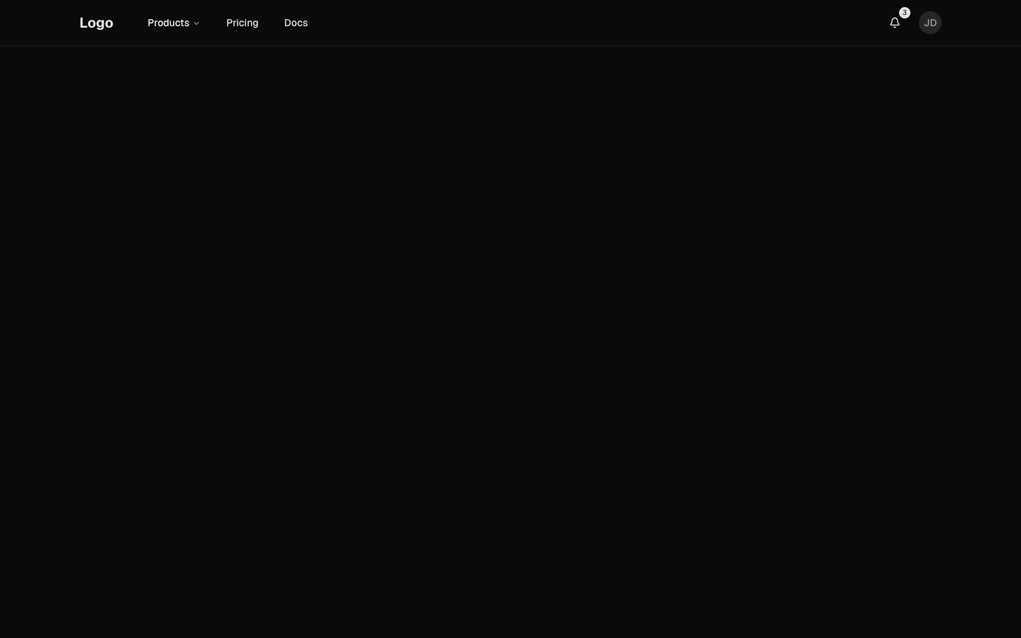
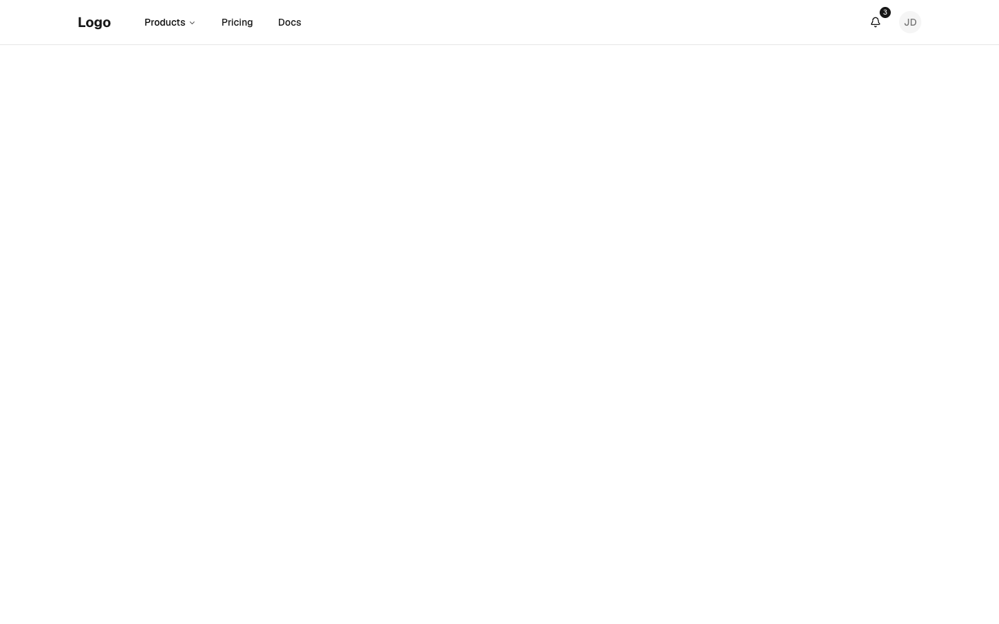
Header with dropdown navigation and user menu
header-02
header-02
Files
app/header-03/page.tsx
import { Header } from "@/components/header-03"
import { dictionary } from "@/registry/bases/base/blocks/header-03/header-03-dictionary"

export default async function Page({
  params,
}: {
  params?: Promise<{ lang?: string }>
}) {
  const { lang } = (await params) ?? {}
  const locale = lang === "ar" ? "ar" : "en"
  return (
    <div className="flex min-h-svh flex-col">
      <Header dictionary={dictionary[locale]} lang={locale} />
      <main className="flex-1 bg-muted/40" />
    </div>
  )
}
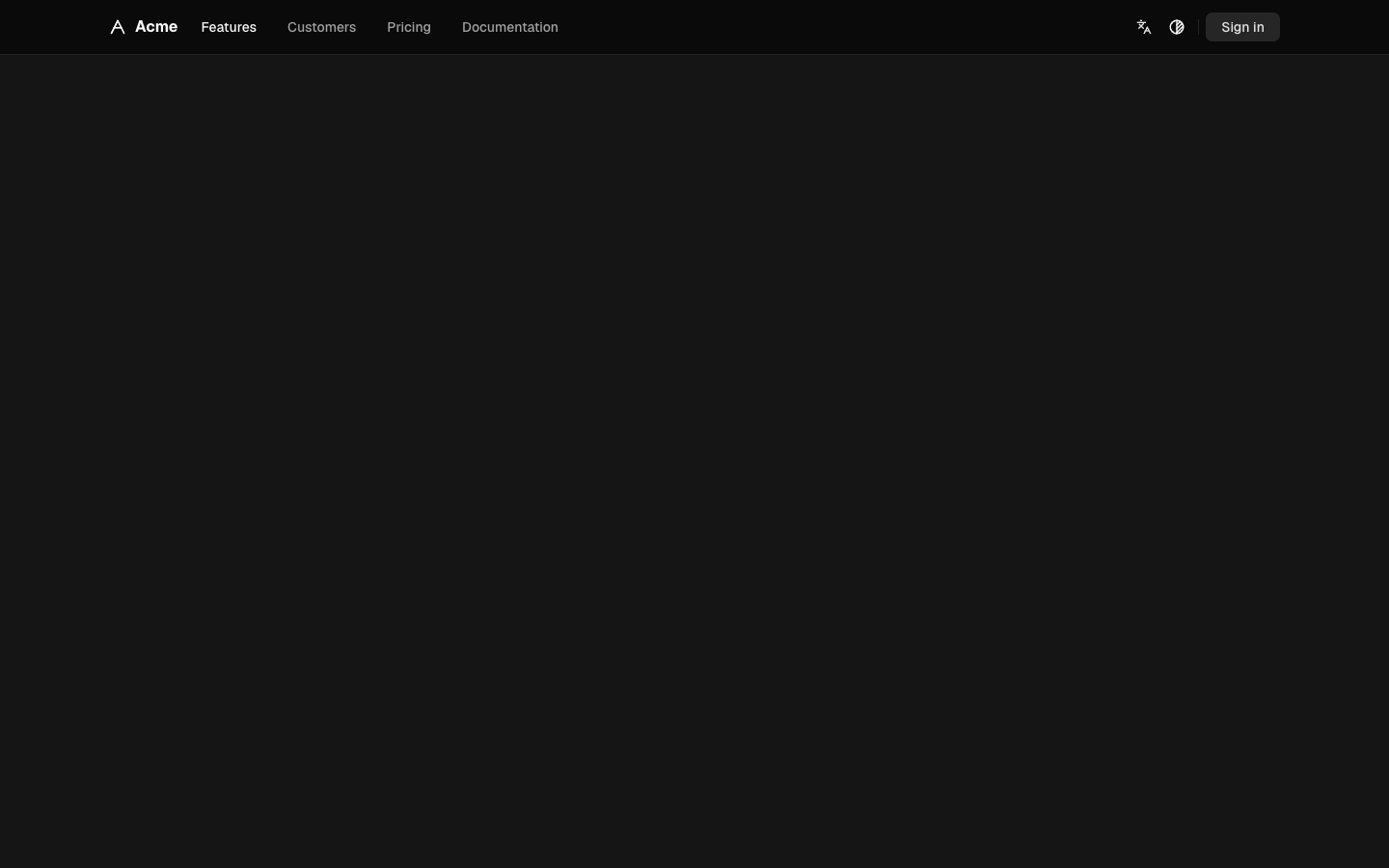
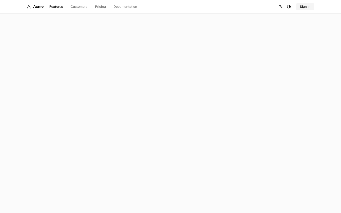
Thin sticky bar: mark and quiet text links on the start side, language, theme and sign-in on the end; a "Menu" control opens a sheet of large links on phones.
header-03
header-03
Files
app/header-04/page.tsx
import { Header } from "@/components/header-04"
import { dictionary } from "@/registry/bases/base/blocks/header-04/header-04-dictionary"

export default async function Page({
  params,
}: {
  params?: Promise<{ lang?: string }>
}) {
  const { lang } = (await params) ?? {}
  const locale = lang === "ar" ? "ar" : "en"
  return (
    <div className="flex min-h-svh flex-col">
      <Header dictionary={dictionary[locale]} lang={locale} />
      <main id="main" className="flex-1 bg-muted/40" />
    </div>
  )
}
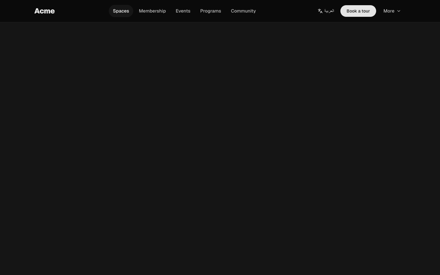
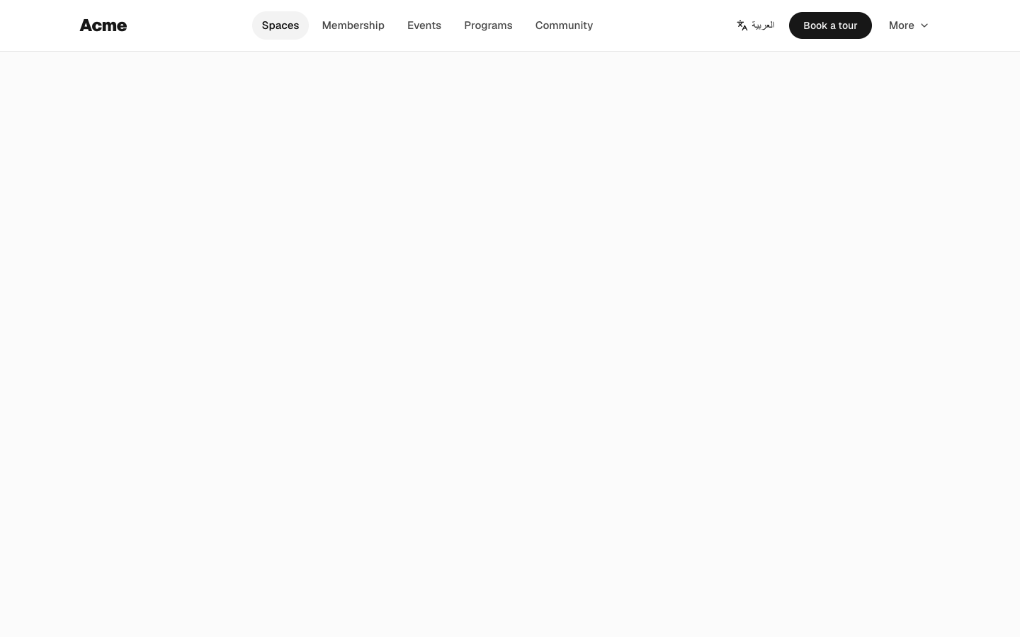
Bold wordmark with pill-shaped nav links, a language link, a rounded call-to-action and a "More" menu; a full-height sheet of large links on phones.
header-04
header-04
Files
app/header-05/page.tsx
import { Header } from "@/components/header-05"
import { dictionary } from "@/registry/bases/base/blocks/header-05/header-05-dictionary"

export default async function Page({
  params,
}: {
  params?: Promise<{ lang?: string }>
}) {
  const { lang } = (await params) ?? {}
  const locale = lang === "ar" ? "ar" : "en"
  return (
    <div className="flex min-h-svh flex-col">
      <Header dictionary={dictionary[locale]} lang={locale} />
      <main className="flex-1 bg-muted/40" />
    </div>
  )
}
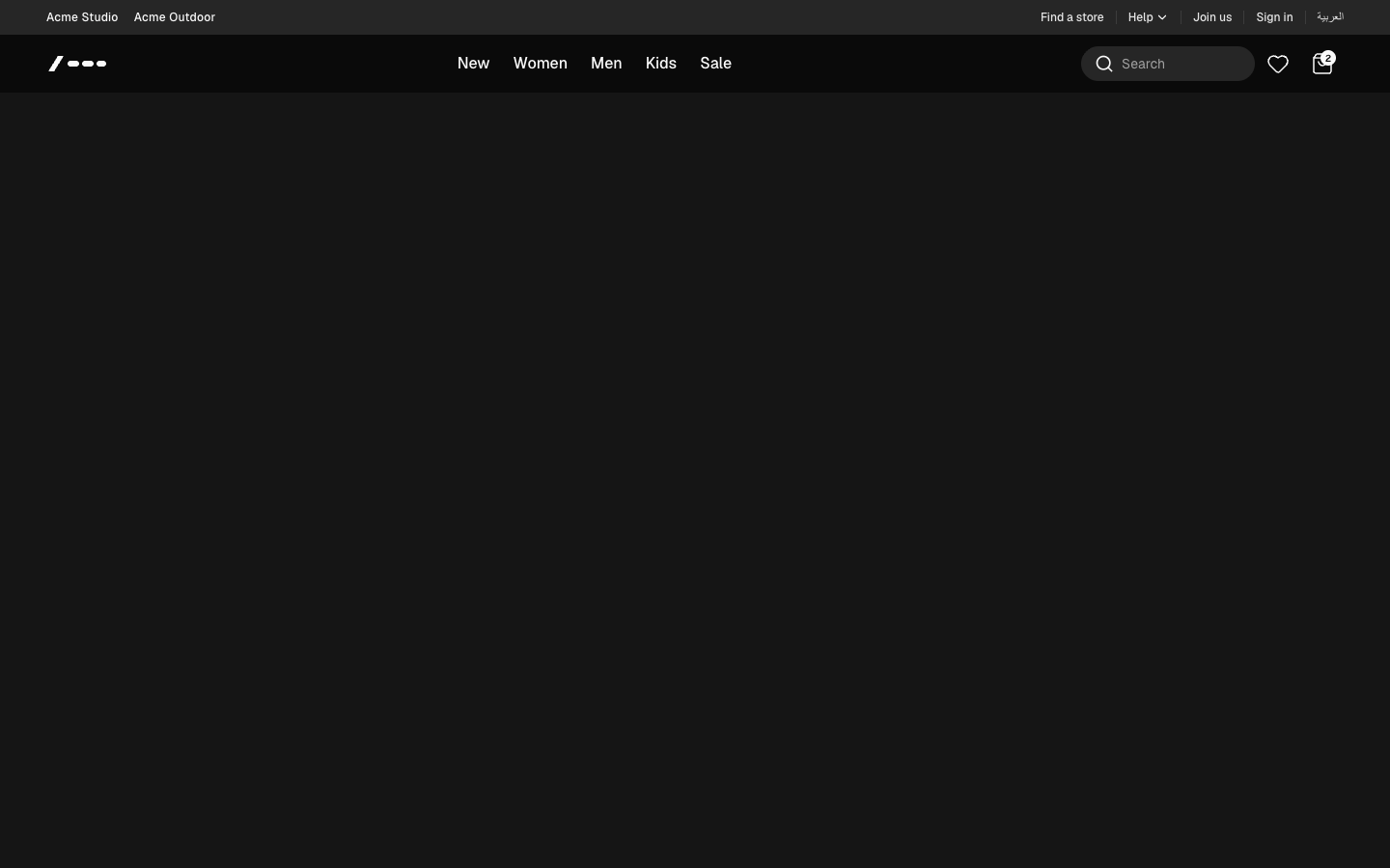
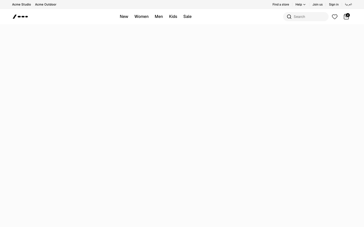
Storefront header: utility top bar with a help dropdown, category nav with full-width mega menus, an expanding search tray, favorites and bag, and an accordion drawer on phones.
header-05
header-05